Technology in general has been rapidly improving in the past few years, and the internet specifically has shifted from a useful tool into an everyday necessity, with constant advancements and changes that are undoubtedly meant to simplify people’s life. With that in mind, it’s highly important for businesses and users alike to make sure the internet is as accessible and easy to use as possible, which is why web accessibility should be at the top of the list of every business and company owner who wants to thrive online.
Web accessibility refers to developing a website that allows users to navigate and interact with it regardless of physical, cognitive, or other abilities. It means designing your website with the intention of welcoming and allowing all types of visitors to be able to fully use your website regardless of any possible disabilities, limitations, or impairments. It includes using assistive technology such as screen readers and others. These technologies enable people with disabilities to navigate web pages with devices other than a mouse and ensure everyone can have access to your content. A good web accessibility strategy should cover all potential disabilities that affect access to the web, such as auditory, cognitive, physical, or visual disabilities.
From a humane point of view, an inaccessible website is excluding a significant population, making it harder for them to have equal access to the tools most people take for granted on a day-to-day basis. From a business point of view, it also excludes potential customers, raises the possibility of a lawsuit, and may lower search engine rankings. There has historically been an overlap between accessibility and high rankings in Google’s SERPs. Due to this overlap, marketing firms should incorporate accessibility into their SEO strategies.
What is web accessibility?
In a nutshell, web accessibility is the process of making websites accessible to all visitors, including those with disabilities and impairments. Web accessibility involves web masters adhering to specific web design standards that ensure that those with disabilities or challenges have an equal user experience that is at least as good as those without. The right to equal access to online materials is very important for us at Nomadic Advertising, which is why we consider it a crucial step in designing your website.
Why is web accessibility important?
By implementing web accessibility, you will increase the usability of your website for all visitors and make it easier for them to access your information. The importance of conforming to web accessibility principles includes the following:
Reach a wider audience
Around 1 billion people worldwide have some form of disability, which means an inaccessible website is potentially excluding a sizable portion of the population. By implementing a Web-accessible strategy, you can drastically increase your website reach without requiring technology-specific adaptations for every mode of accessing your content; doing your part to help guarantee equal access to the internet for everyone is just an added bonus.
It is a legal and ethical obligation
Several countries have civil laws and regulations that mandate website accessibility. Violations of these laws can lead to the loss of support, including federal financial aid. Large corporations, online businesses, and academic institutions have been sued for failing to uphold the law’s web accessibility criteria. It is essential to make web accessibility a priority in your organization to avoid the financial and other consequences of not implementing web accessibility.
Raise search rankings
Incorporating web accessibility into content creation improves usability and creates a more natural user experience. This is due to the fact that online material that complies with accessibility standards will likely be more user-friendly overall. A Web that is accessible can encourage more social engagement among individuals with disabilities. As the usability of your website advances, your page will probably rank higher on search engines.
Introduction to web accessibility
Web accessibility refers to ensuring that everyone has equal access to the internet. Making a website accessible entails following specific web development guidelines to make web information perceptible, operable, and understandable.
An accessible website can have a great and positive impact on someone with a disability because it removes certain issues, such as communication barriers, that some people might face in the real world. These types of physical limitations can be removed simply by making sure everyone can have access to your website.
Before creating an accessible website, you must understand accessibility basics and its legal responsibilities, as well as learn how to execute it properly.
What makes a website accessible?
There are certain features and elements that, when used properly, can lead to anyone being able to use your website independently. This might sound simple, but there are actually a few aspects you have to keep in mind in order to ensure this apparently easy fact.
An essential component of accessibility is the capability of users to modify the content in order to make it more useful to them. Making your website offer functionality, such as options to adjust elements like font size, type, and color, is part of accessibility. You might also have customization options on your websites, such as text-only, screen magnifier, and others. We strongly believe these additional features can make a significant difference and you should consider adding them, but you must consider them carefully. If they are not properly incorporated, they can interfere with the natural accessibility of a website.
Many users who need or want these features already modify information using third-party applications or assistive technology, but it would be a lot easier if they could simply do those things directly from your website.
Making your website accessible
Many companies struggle with the process of creating an accessible website. However, we believe several parts of accessibility are relatively simple to comprehend and put into practice.
Here are a few easy techniques to make your website accessible to everyone:
Use headings to organize content structure
Using headings (h1>, h2>, etc.) appropriately and strategically will enable screen readers to understand and interpret your content. This specifically helps individuals who use assistive technologies to navigate the website and browse the information on your page. Do not skip heading levels, such as moving from an h1 to an h3, because screen reader users may assume that some of the content is missing if you skip headings.
Add Alt tags
Images should have alt text so that individuals who use screen readers can understand the message conveyed by pictures on the website. This is essential for educational images like infographics. The purpose of the alt text is to describe the message you want the image to convey and ensure the descriptions are as accurate as possible, to the point where someone can completely imagine a picture based solely on the description you add. This is precisely what users with visual disabilities need to do.
Descriptive links
Use text that accurately describes the link’s destination when incorporating links in your article. The phrase “click here” is inefficient for screen reader users and is not regarded as descriptive. Some screen readers frequently fail to read the link in the context of the rest of the page. For them, descriptive text effectively communicates the context of links. For example, it’s better to write “to learn more about our company, read about us” instead of “to learn about our company, click here.”
Use high-color contrast
For some people, text may be hard to recognize due to clashing colors. Some users may have color blindness and difficulty seeing text if the color contrast is low. Because of this, we advise selecting colors with a high contrast ratio, such as black and white. The color contrast on your website should ensure that all components on the page are distinguishable. The text needs to be prominent rather than blending into the backdrop. There are several free tools online you can use to evaluate color contrast.
Add Keyboard Navigation
Some people with disabilities might not be able to use a mouse or trackpad, and instead can only access content through a keyboard and the “tab,” “arrow,” or other input keys. In order to make sure that keyboard-only visitors may properly browse through the site’s information, the tab order should match the visual order. We use jump lists to break up long pages with a lot of content, so keyboard-only users can skip to the necessary sections on the page.
Writing accessible content
As you can see, the first stage of making your website accessible will start with the initial design. It could be easier if you make your website accessible from the start, rather than changing it once your website is already live. However, this second option is still completely possible and we encourage you to add these features to your website regardless of how long it has been live.
Once that first stage is completed, it’s time to evaluate your content and how accessible it is. Accessible writing is when your content is straightforward for everyone to consume, which doesn’t sound so hard, does it?
Here are some tips for writing accessible content:
Write plainly
People won’t be able to comprehend your writing if it is too complex. Clear communication increases accessibility. If your content is specifically intended for people with disabilities, then you must write clearly and concisely at all times. Keep your sentences brief, with a maximum of 20–25 words at most, and use simple words. You may assess how readable your text is using tools like Hemmingway Editor. Aim for a grade 8 or lower readability level to comply with WCAG criteria.
Heading structure
When writing accessible content, using headings is crucial. They give screen reader users the option to skip directly to relevant portions of text, which might help them save time. The heading style’s numbers give the screen reader structural context and aid non-visual users in understanding the information even when they cannot see the document’s visual breaks. Good headings outline the information on a page.
Create transcripts and captions for multimedia
Provide transcripts or captions along with audio and visual content. Include spoken information and sounds crucial for understanding the content in the audio descriptions and captions. Include a description of the significant video content in the transcript, such as “Lilian enters the room.”
Accessibility and SEO
The features that enhance accessibility and SEO performance overlap. The goal of both accessibility and SEO is to provide people with relevant content, to make sure the people who need or are interested in your content can easily find it.
Web accessibility can help your search engine optimization (SEO) efforts and raise your website’s organic search ranks when properly implemented. You should incorporate accessibility in your SEO strategy and audits if its goal is to bring users to your website through search engines.
Guidelines and WCAG
SEO agencies and marketers working on SEO must have a basic awareness of the W3C’s Web Content Accessibility Guidelines (WCAG). Your SEO health will significantly improve with even little modifications to the four principles.
WCAG
The World Wide Web Consortium (W3C) developed the Web Content Accessibility Guidelines (WCAG) to provide policies for making Web content accessible to people with disabilities. The Web Content Accessibility Guidelines (WCAG) standards are reliable and stable; once published, they remain unchanged. There are two versions of WCAG; version 2.0 and version 2.1.
Content that complies with WCAG 2.1 complies with WCAG 2.0 as well. The WCAG standards comprise 12–13 guidelines. The guidelines are divided into four categories: perceivable, operable, understandable, and robust. Every guideline has quantifiable success criteria, and there are three success criteria: A, AA, and AAA. The website content must meet the success criterion to comply with WCAG.
An accessible website must adhere to four major guidelines, referred to as POUR:
Perceivable
This means removing any obstacles a user might encounter when accessing your content. This includes providing text alternatives and a logical framework to make websites accessible to screen readers.
Operable
A website must be functional for all users, regardless of their browsing device, emphasizing the user interface and navigation. This also entails giving users enough time to finish any given task.
Understandable
Users must be able to navigate a website, understand the user interface, and comprehend the information presented on a webpage. This includes having a dependable navigation system.
Robust
A website must be accessible and understandable by various technologies and platforms, such as screen readers. It must also continue to function properly after all platform updates. When converting the contents of a web page into another format, assistive technology software often uses the HTML file that makes up the page. This is why the HTML code for your pages needs to be well-written.
Accessible website examples
The following are websites that conform to web content accessibility guidelines:
BBC
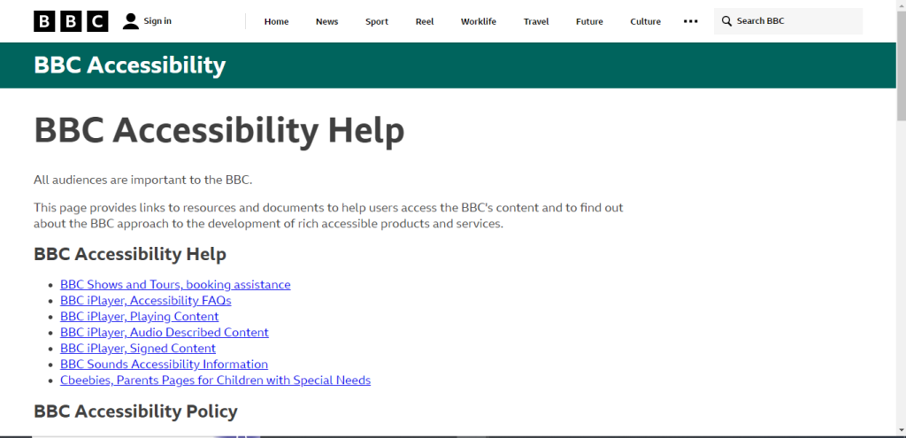
The BBC website has an “Accessibility Help” feature in the website’s footer. This makes it possible for new site visitors who use a keyboard or screen reader to find assistance immediately. The BBC website has several minor accessibility features.
GOV.UK
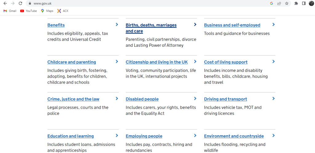
GOV.UK is a great example of an all-inclusive accessibility website. The HTML is structured and semantic. The federal government’s website has several minor accessibility features and elements to ensure that disabled users can fully use the website. In the website design system documentation, caution was issued for potential government websites that may want to adopt their design system: using the design system does not ensure WCAG 2.1 level AA compliance.
The National Institute of Health
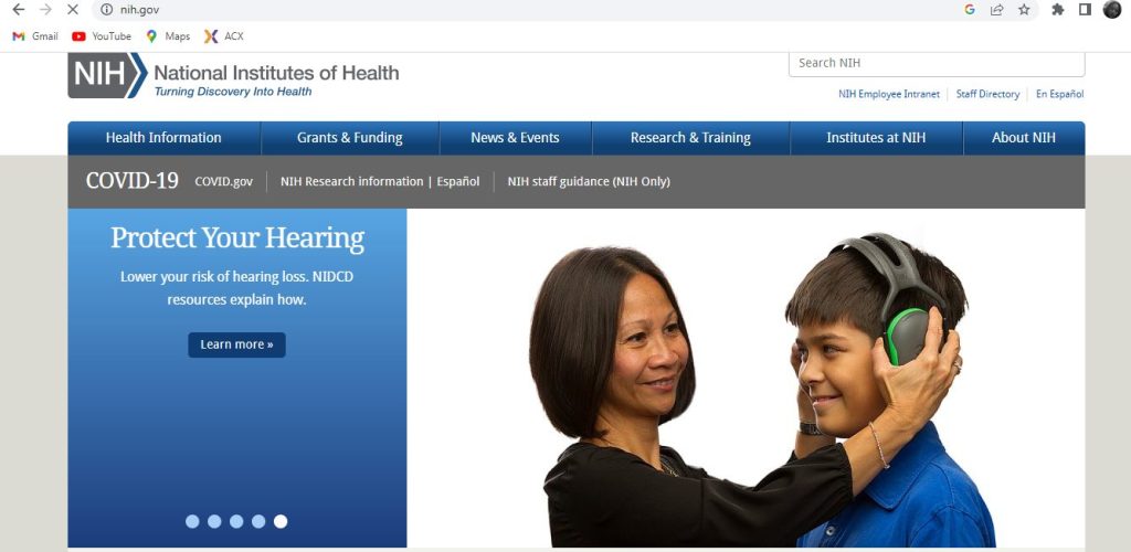
Healthcare websites must ensure that their content is accessible to all users considering their target audience. The NIH achieves a high rate of accessibility by using high color contrast between the text and background on its website. The healthcare website also uses straightforward and consistent navigation and descriptive links that explain to users what would happen if they clicked them.
Accessible web design examples
The following are website designs that meet web accessibility criteria:
Parramatta park
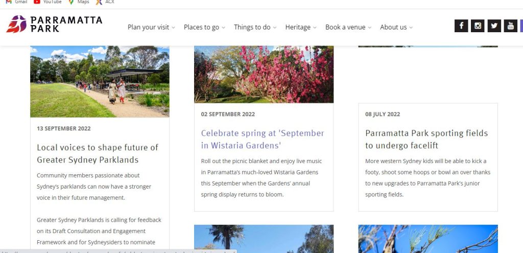
The park website is a visual feast, using vibrant, eye-catching colors and color choices that still accommodate visitors with vision impairment. The park website features alt tags for important photos, size of elements, link design, and background images for decorative images.
NSW Government
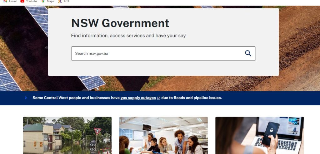
The NSW.gov website ensures its content is accessible to the broadest audience possible, including readers who use assistive technology. The website has distinct layouts, large graphics, and a clear visual presentation of the information. The colors are vivid and bold and meet accessibility contrast level criteria, and visitors can use a keyboard to access its functionality.
Examples of websites with bad accessibility
Unorganized layouts, lack of color contrast, non-responsive design, and hidden navigation menu are all characteristics of websites with bad accessibility. The following are examples of what a poorly designed website with low accessibility looks like:
ASOS
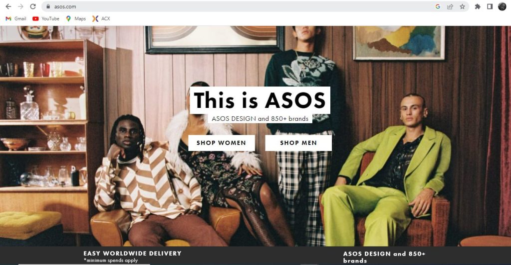
ASOS provides fast fashion options. However, there’s a significant possibility you won’t be able to purchase anything if you have any mobility impairments. The website has accessibility errors such as poor color contrast, missing labels, and text-over images. This makes it a difficult shopping experience for impaired ASOS fashion enthusiasts.
ZARA

The navigation menu on the clothing website is hidden behind a hamburger button, and the texts are small. Without a clear call to action, visitors could get lost or frustrated. Screen reader users or those who use alternative input devices such as keyboards would have issues navigating the website.
eBay
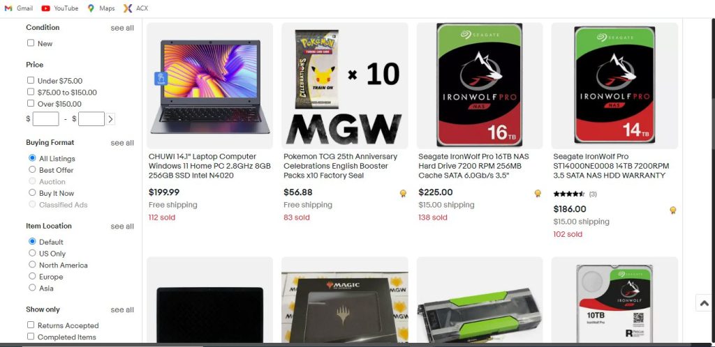
Making an informed choice is essential when buying something from an online marketplace like eBay. By including too much information on its product pages, eBay tries to address this problem, but the result is information overload. The site’s multiple options are presented at once, which makes it challenging for users with cognitive disabilities to navigate it.
Web accessibility tools
Web accessibility tools are software applications or online tools that assist you in determining if your web content complies with accessibility standards. You can uncover potential accessibility problems quickly with the use of web accessibility evaluation tools. Web accessibility tools can perform fully automated inspections and assist you with manual evaluation.
However, keep in mind that web accessibility tools cannot determine accessibility, they can only aid the process. Some of the best web accessibility tools are Accessibility Checker, WAVE, Sa11y, DYNO mapper, and Cynthia Says.
Website accessibility checker
The accessibility checker compares your website to a list of guidelines that detect potential problems for users with disabilities. The Accessibility Checker categorizes each issue as a tip, an error, or a warning, depending on how serious it is. Some accessibility checker provides instructions for fixing web accessibility issues.
Some web accessibility checker tools include:
WAVE: The Web Accessibility Versatile Evaluator is a tool created by WebAIM that is accessible online and as a Firefox add-on. WAVE can spot various WCAG and accessibility issues, but it also makes it easier for people to evaluate web content. WAVE browser plugins for Chrome, Firefox, and Edge are available to test accessibility within your web browser.
Accessibility Checker: This free online audit tool checks your website for compliance with important accessibility international laws. The checker will describe each error it finds, who it affects, and how to resolve it. This aids in obtaining a more thorough understanding of your website’s accessibility.
DYNO Mapper: is a website accessibility checker that generates sitemaps for websites and online apps. DYNO Mapper features include content inventory and auditing. It provides monitoring and alerting features and authentication capabilities for checking private websites and online applications. The formats that Dynomapper supports are CSS, HTML, and XHTML.
Key takeaways
- Web accessibility refers to developing a website that allows users to navigate and interact with it regardless of physical, cognitive, or other abilities.
- A good web accessibility strategy should cover all potential disabilities that affect access to the web, such as auditory, cognitive, physical, or visual disabilities.
- With web accessibility, you’ll be able to: reach a wider audience, raise your search rankings, and comply with legal and ethical obligations.
- To make your website more accessible, you can: use headings to organize content structure, add Alt tags, use descriptive links, use high-color contrast, and add Keyboard Navigation.
- One important aspect of website accessibility is writing accessible content. That means writing plainly, using the proper heading structure and, most importantly, creating transcripts and captions for multimedia.
- Building an accessible website can have a huge impact on your SEO strategy.
- There are four major guidelines for an accessible website. It has to be Perceivable, Operable, Understandable, and Robust (POUR). If you do this, you will not only create a website that is suitable for everyone, but you will also be complying with the Web Content Accessibility Guidelines (WCAG).
- There are a few accessibility checkers you can use, such as WAVE, Accessibility Checker, and DYNO Mapper.
Conclusion
By now it should be abundantly clear just how important it is to make your website accessible. Everyone deserves to have equal access to the internet, and that doesn’t always mean having access to Wifi, it also means being able to fully and properly navigate regardless of any physical impairments someone might have.
We hope this guide can help you understand if your website is accessible enough for all users or if there is any room for improvement. Most accessibility best practices are handled when you optimize your website using the various SEO on-page factors. If we helped you realize your website might not be as accessible as you thought then we can help you with that. Here at Nomadic Advertising, we care deeply about designing a website that can fulfill all of our client’s needs, which is why we have a dedicated team of designers and builders ready to put the latest technologies and trends at the tip of your fingers. On top of that, we also are SEO experts, completely capable of optimizing your website and helping you build a solid content strategy. The fact that we are also digital marketers who can position your website among Google’s top organic search engine results is just the cherry on top.
Contact us if you’d like to know more about how we can help you improve your website’s accessibility and learn everything else we can do for your business. You can also book a FREE 30-minute consultation where we can discuss the strategy we could tailor-make for you. Let’s start by maximizing your website’s accessibility.


