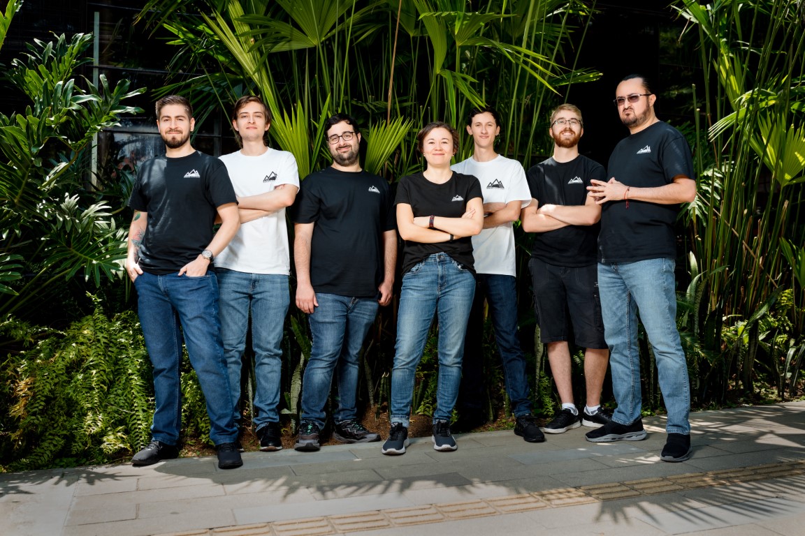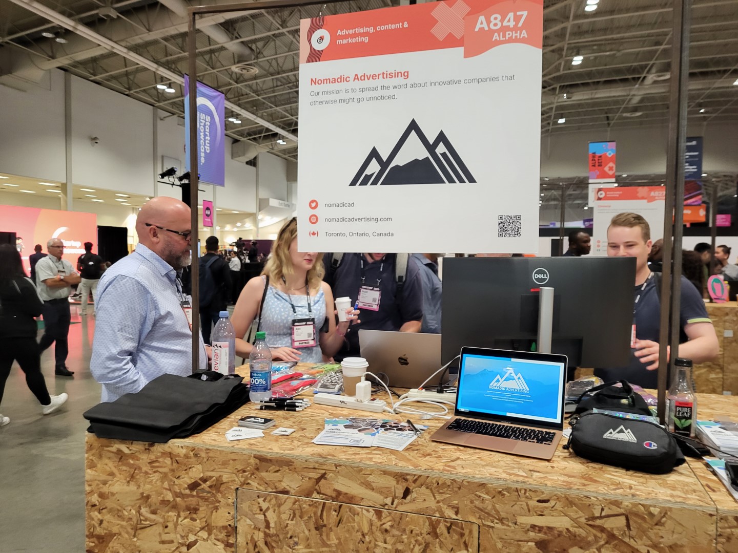


Nomadic’s story began over a decade ago in 2014 with a simple mission: to spread the word about innovative companies that otherwise might go unnoticed. Over the years, we’ve expanded and evolved, while remaining deeply connected to our clients’ growth and the ever-changing digital landscape. Today, we have partnered with and helped scale hundreds of ambitious companies, including Bath Fitter, Kodak Lens, Alcon, and 180 Smoke. As a borderless, 100% remote company, our presence stretches far beyond a single office, bringing together diverse, top-tier marketing experts from across the globe to apply top-tier thinking with precision and speed. While our business has grown and transformed in many ways, our corporate brand has looked largely the same since 2014. Today, we’re proud to introduce a new brand identity, one that rejects the “cookie-cutter” agency model to better reflect who we are and symbolizes our promise to guide clients through uncharted territories with the philosophy: “We don’t adapt to your path. We show you the way.” It is a defiantly authentic representation of the high-level strategic partners we have become, and the future we’re building together.
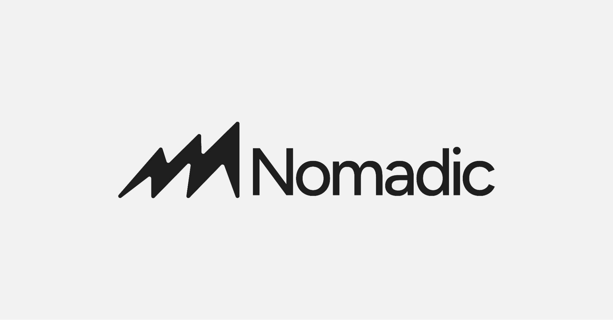
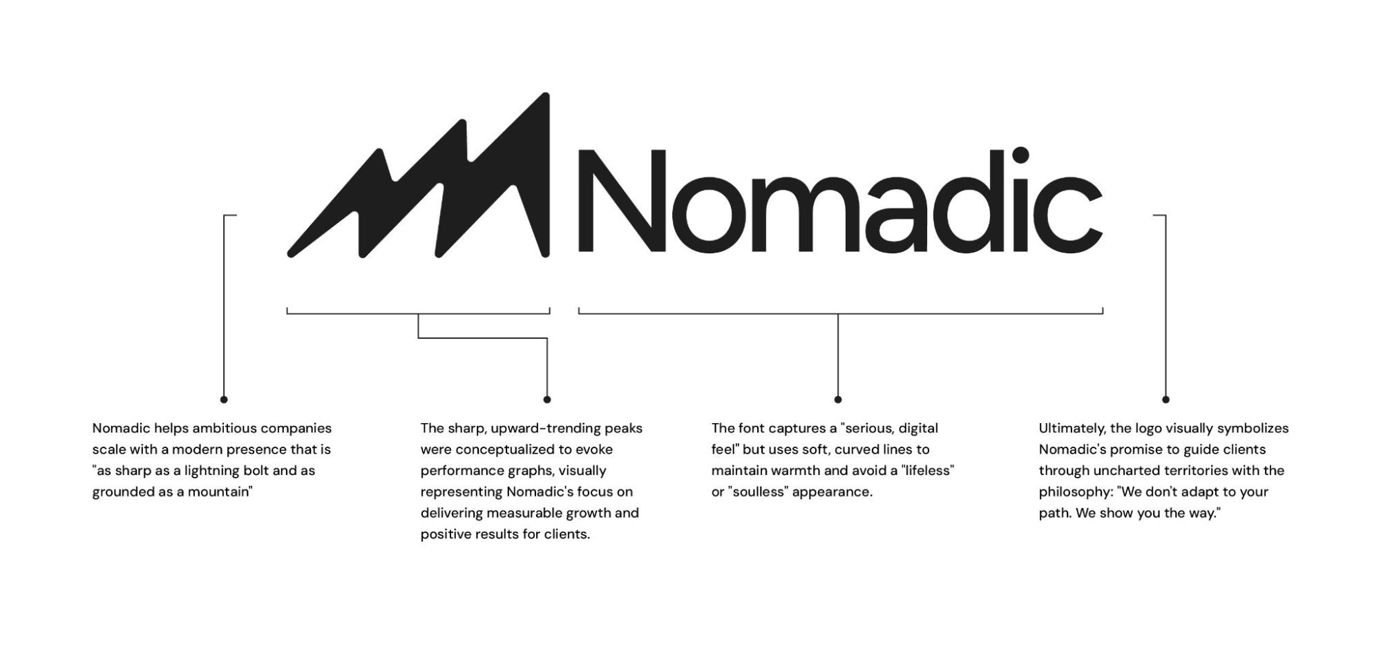
Shedding the Noise, Defining the Mindset The rebrand signals a deliberate shift from a traditional service vendor to a high-standard strategic partner. By shedding the word “Advertising” from the logo, Nomadic moves past the limitations of just providing services to focus on what it has always truly championed: an unyielding mindset. As Johnny Baskin, CEO of Nomadic, explains: “For years, our partners haven’t looked to us just for ad placements; they’ve looked to us for the mindset that scales their business. We are evolving to reflect what we have been all along: a partner that doesn’t just adapt to your path, but actively helps you forge it.” “Our original logo felt like a placeholder, an underrepresentation of who we are,” explained Camila Zelaya, the lead designer behind the transformation. “It featured a mountain shape, but lacked personality. When we initiated the rebranding process, the goal was clear: we needed to share our culture and point of view. So this isn’t just a new logo, it was a self-discovery process, and the start of us finally looking like who we have always been internally.” The original mark had too many elements layered in a way that was often hard to notice, such as an upward graph inside the mountain. We kept those core ideas to pay homage to where we started, but turned them into something different. The new mark strips everything down into a single form: a mountain, an upward graph, and a striking lightning bolt. We also softened the edges instead of leaving them sharp, echoing the rounded curves in the typeface we paired it with. This contrast is highly intentional, symbolizing a core brand philosophy that balances human warmth and grounded, data-driven strategy with high-velocity innovation. We also got rid of the word “Advertising” in the logo to focus on our philosophy. “Advertising is merely a service, but Nomadic is a mindset,” the designer added.
Beyond the visual aesthetics, the rebrand bridges the gap between Nomadic’s exceptional internal culture and its external market presence. Built as an “Ethos Brand” Nomadic is positioning itself in the market, disrupting the standard “Agency Theater” to offer growth leaders direct, unfiltered access to specialized experts without the corporate bureaucracy. The brand transformation will continue to roll out incrementally over the coming months, culminating in a ground-up website redesign and an aligned suite of strategic visual and positioning updates.